Thursday, April 18, 2013
Tina - Lesson 6 - Project 1 - Depth and Atmosphere, Shape and Line
OK. I followed the instructions
in Lesson 6 each step: paint lifting, transparent paint, lifted and wiped with
damp paper towel, veiled white paint, then opaque white paint, lifting from
tacky surface, then dry-brush over textures, and obscuring depth with opaque
white. Finally, I added shape and line, veiled with diluted white paint. It was
fun playing with paints. But did I accomplish the objectives? Have a look and tell me what you think. :-)
On #1, I started with 3
colors using Liquitex acrylics neutral gray and cadmium yellow medium, and Reeves
acrylic titanium white. Gray and yellow gave me beautiful olive green like the
kind you see in autumn. I painted grids of colors gray, gray-white, yellow,
yellow-gray, yellow white and just plain white. I use techniques such as
paint-lifting, lift and wiped with damp paper towel, transparent paint, veiled
white paint and opaque white paint. I decided to try the donut. Surprisingly, I
like the feel of it – maybe because of the scale and thickness of the donut
vis-à-vis the line and the paper format. It feels balanced.
 |
| Ex. #1. Acrylics on Water Color Paper, 9 x 9 |
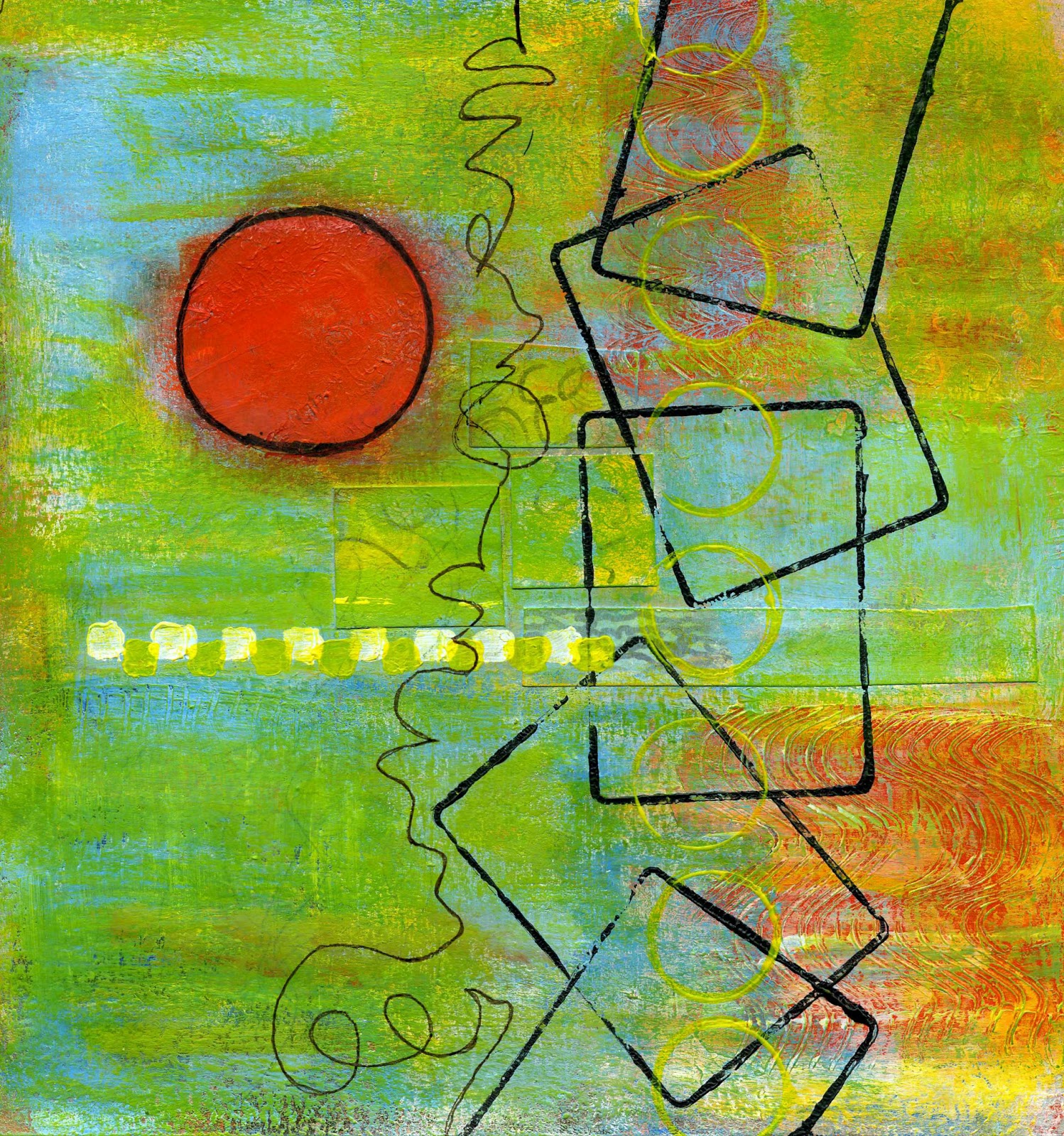
Moving on to #2, I worked the
same process as #1. I was in-to-it, feeling good; added blue texture on the
right side, three small donuts equal size in blue, and a black line. The
composition didn’t feel quite right; the three donuts looked like its floating
by themselves. In my dream, I saw the three donuts in a triangle like the
billiard balls. So, this morning, I added a thick black triangle around the
donuts and tried to veil it and the texture with white paint. It didn’t work.
The more I worked it, the more I messed up. Finally I wiped the whole paper
with damp paper towel and re-drew the triangle in black and added the blue
texture underneath it. Lessons learned here: (1) once I glazed the piece with
Golden’s glossy glazing liquid, all the colors are locked – can’t manipulate
them anymore; (2) the first impression is always the right one; if it feels and
looks good, leave it alone. So here it is:
 |
| Ex. #2. Acrylics of Water color Paper, 9 x 9 |
Ah, just when I thought I have
mastered the techniques, curiosity took over, what if I do this, what if I do
that? So, I tried complementary colors blue and orange. On the first layer, I
was able to hold the balance between the two colors. Then I added the white and
I ran into problems. Colors became muddy and it took me awhile to recover the
bright colors. I added texture by applying white paint using sea foam. The
stain created a kind of lacey texture. It looked pretty. I added a rectangle in
orange; hmm, not strong enough – color is too similar to the background. I changed
the orange to black, ah, too strong. I added veiled white and dry-brush, and I
gave up. You see, I forgot the lessons learned in #2. So, this is it, for now.
Do you see the wind blowing through?
 |
| Ex. #3. Acrylics on Water Color Paper, 9 x 9 |