Friday, April 19, 2013

Tina - Lesson 4 - Pattern and scale

Wednesday, April 3, 2013

Tina - Lesson 4 - Pattern and scale


This assignment looks simple and easy; do a background grid and add patterns and texture on it. But the process is formidable for me. Unlike the Cruciform project, where the background has each grid clearly defined in four corners, this Pattern and Scale project has no clearly defined background. Looking at Jane’s example I see light and dark application of the paint, the grid is faintly visible, no hard edges, just a delicate balance between light and dark. This poses a tremendous challenge for me, as I am used to work and function in a clearly defined environment (Oh, attachment...).  I couldn’t get the paint mix right and when I do divide the plane in grids the lines are too pronounced. This makes me long for watercolor washes… Well there’s an idea! But for now acrylics it is and attempt I must – as you see in the 6 small pieces below. Oops - I just noticed the title of the Lesson "Pattern and Scale" - Did I do this assignment right? Ahhh --- if I have to ask...huh???
Here is my sketches of pattern and scale:  


And here are the 6x6 paintings:


Tina - Lesson 5, Project 1 & 2

Saturday, April 6, 2013


Tina - Lesson 5, Project 1 & 2

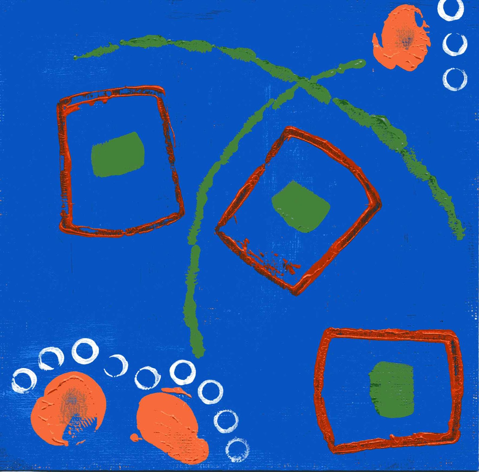
OK, here I just try to relax and let go of preconceived ideas about what the pieces should look like, and try to let my heart guide me. Not easy for all the resistance that wants to put mind in control. The bulk of the work and attention was on creating the background. I think I got the look I wanted - light and dark, but still need to explore more possibilities of color combinations, line and shape. Am also looking to balance time and effort in doing this work - how much time is enough to work on a piece and when is a piece complete and final? So, here they are:

Project 1:       Line & Grid Studies - 6x6


Project 2:  Open Grid with Lines - 9x9


Project 2 is a bit easier to do and more relax for me since I don't have to worry about painting the collage swatches. The only thing on my mind was to balance the colors. Hmmm... I thought I'll go back in and add paint to the white spaces and see what happens.

This morning I found and watched your video "Scribble Collage, with Hand-Painted Paper" that I bought a while back but never viewed it. OMG, I could kick my self in the butt --- everything I need to know about making the collage swatches are IN the video! Oh well, it's never too late to learn the techniques in there. I'll also be buying your books to learn more of this art making techniques and process. It's a beautiful way to create authentic and original artwork. I'm hooked! I reckon I'll be doing a lot of this type of art making from now on. The process really  stretched and expanded me, like yoga and taichi. It is good exercise for my mind and ego! :-)

Tina - Lesson 4 Project 2 Composition Using Pattern

Friday, April 12, 2013

Tina -

Finally, I got three samples for this project. Tried to follow the video sample on #1 and #2 for the sake of learning, but donuts have no place in my life; needless to say, we don't get along well on paper either. In #2, I added pink and yellow accents using oil pastel for variety. And in #3, I use collage to add colors, interest and to distort the squareness of the grid on the upper part.


Tina - Lesson 5 - Re-do Project 1 and 2

Sunday, April 14, 2013

Tina - Lesson 5 - Re-do Project 1 and 2

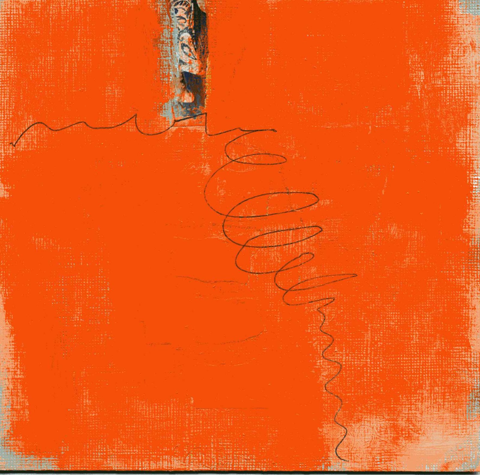
Whew, this was a struggle to complete, especially being aware of the closing date. I did all pieces over but I still have a hard time drawing the lines. I looked back to my sketches of the line study. It seems so spontaneous and easy. Why am I having trouble in Project 1 & 2? Thinking too much? Yeah, that is a problem.


Anyway, below is Project 1;  I repainted the original and re-drawn the lines.


And here is Project 2. Finding monochromatic collage paper is a bit of a challenge since I did not have a collection of monochromatic papers to begin with. I may need to make some or start collecting this type of papers for future work. I like the look and the feel of monochromatic collage. :-)


Note:  I intent to complete Lesson 6. But just in case I don't complete it by closing date (April 24), I like to thank everyone now for posting and sharing your process. Many times I was stuck and unable to continue - but your work inspired me and gave me the needed push to go on. All of you are great talents, I'm honored and privileged to be part of this experience with you. I'm also grateful to have found Jane as a teacher. You are truly a great artist and an incredible teacher. Thank You for your generosity and patience. I very much appreciate you!

May you all be safe, be healthy, be happy and live with ease.
Till next time... :-)


3 comments:

  1. Really fabulous job, Tina! I'll probably leave the blog open for an extra week, so post lesson 6 if you get a chance.

    These orange ones are just gorgeous! Nice variety of line use. I love the way the orange is painted OVER something. What do you mean you re-painted the original? What original? It looks great, like there is all this space just hovering under the surface.

    The open grids are lovely. The only thing I would say is that you use a very fine line in all three. How about experimenting with different types of line?
    Reply
  2. Thank You, Jane. About the lines; oh yes, I noticed that too AFTER I scanned them. In the previous submission, I used the fine point of a black Prismacolor for all the lines. They were too thick, strong and severe. I didn't like the feel of it - too dominating for the planes especially against the white background. Then on this submission, I decided to tone down the black lines using a black Fine Sharpie Pen, which gives me thinner but cleaner lines. I thought about using different drawing tools for the lines to get a variety of thickness but I didn't want to risk messing up at this late hour. I'll try to vary the lines in Lesson 6. Are we limited to use one line only in a collage?
    ReplyDelete


    1. There is no "messing up" here. Just exploring. So do try the different lines in Lesson 6. It just gives you a wider range of visual vocabulary.

Tina - Lesson 6 - Project 1

Thursday, April 18, 2013

Tina - Lesson 6 - Project 1 - Depth and Atmosphere, Shape and Line


OK. I followed the instructions in Lesson 6 each step: paint lifting, transparent paint, lifted and wiped with damp paper towel, veiled white paint, then opaque white paint, lifting from tacky surface, then dry-brush over textures, and obscuring depth with opaque white. Finally, I added shape and line, veiled with diluted white paint. It was fun playing with paints. But did I accomplish the objectives? Have a look and tell me what you think. :-)
On #1, I started with 3 colors using Liquitex acrylics neutral gray and cadmium yellow medium, and Reeves acrylic titanium white. Gray and yellow gave me beautiful olive green like the kind you see in autumn. I painted grids of colors gray, gray-white, yellow, yellow-gray, yellow white and just plain white. I use techniques such as paint-lifting, lift and wiped with damp paper towel, transparent paint, veiled white paint and opaque white paint. I decided to try the donut. Surprisingly, I like the feel of it – maybe because of the scale and thickness of the donut vis-à-vis the line and the paper format. It feels balanced. 
 
Ex. #1.  Acrylics on Water Color Paper, 9 x 9

Moving on to #2, I worked the same process as #1. I was in-to-it, feeling good; added blue texture on the right side, three small donuts equal size in blue, and a black line. The composition didn’t feel quite right; the three donuts looked like its floating by themselves. In my dream, I saw the three donuts in a triangle like the billiard balls. So, this morning, I added a thick black triangle around the donuts and tried to veil it and the texture with white paint. It didn’t work. The more I worked it, the more I messed up. Finally I wiped the whole paper with damp paper towel and re-drew the triangle in black and added the blue texture underneath it. Lessons learned here: (1) once I glazed the piece with Golden’s glossy glazing liquid, all the colors are locked – can’t manipulate them anymore; (2) the first impression is always the right one; if it feels and looks good, leave it alone. So here it is:
Ex. #2. Acrylics of Water color Paper, 9 x 9
Ah, just when I thought I have mastered the techniques, curiosity took over, what if I do this, what if I do that? So, I tried complementary colors blue and orange. On the first layer, I was able to hold the balance between the two colors. Then I added the white and I ran into problems. Colors became muddy and it took me awhile to recover the bright colors. I added texture by applying white paint using sea foam. The stain created a kind of lacey texture. It looked pretty. I added a rectangle in orange; hmm, not strong enough – color is too similar to the background. I changed the orange to black, ah, too strong. I added veiled white and dry-brush, and I gave up. You see, I forgot the lessons learned in #2. So, this is it, for now. 
Do you see the wind blowing through?
Ex. #3. Acrylics on Water Color Paper, 9 x 9